
There has been a lot of buzz about Opportunity Zones recently and understandably so; it is the newest federal effort to create long-term investments in low-income urban and rural census tract areas. Once designated as a qualified Opportunity Zone, these places are able to receive investments through Opportunity Funds, which are created specifically to invest in these areas.
However, despite the existence of 8,700 total Opportunity Zones spanning 12% of all census tracts in the United States, there has been surprisingly little analysis to identify ‘ideal’ areas to invest in. Many articles published to date consist of top 10 lists recommending the major metropolitan areas in the US anyone could probably guess, which seems a disservice to the massive amount of areas elected as qualified Opportunity Zones.
My analysis sought to develop a rank system for all Opportunity Zones based on 5 economic indicators, and see if there were areas of above-average growth not commonly discussed. I believe the results showed that there are many Opportunity Zones across the US that ranked highly across all 5 indicators, many of those actually not being located on the coasts.
In aggregate, we found that areas in the Northeast and Southern regions in the US had the best performing overall areas, while pockets in the Midwest and Western areas showed significantly better performance vs. other similarly grouped areas. We also found that Unemployment and Median Value of Owner-Occupied Homes were the biggest differentiators in our dataset, with ranking deviations almost double of the other 3 indicators examined.
From the start I applied a more analytical approach to examining the Opportunity Zones and determine if there were potentially highly desirable investment areas that had flown under the radar. To start, I elected to pull 5-year (2011–2016) estimates from 5 datasets found via the US Census Bureau:
For this analysis the importance of each dataset was unweighted, meaning that all 5 rankings per census tract matter equally in the final ‘rank’ for each Opportunity Zone. Weighting the attributes and/or adjusting those included may result in profoundly different outcomes. Based on the attributes examined, there are indeed many opportunity zones showing favorable trends across these attributes, which can exist across the entire United States.
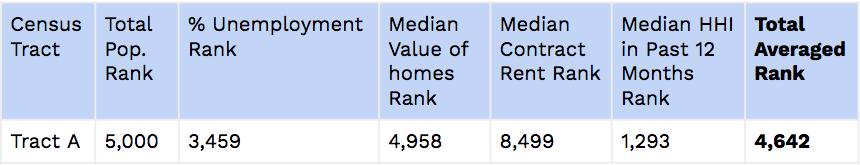
After pulling the data I assigned a rank to every Opportunity Zone per attribute, 8,700 being the ‘best’, 1 being the ‘worst’. Once each Opportunity Zone had ranks for all 5 attributes I averaged all 5 ranks into a ‘Total Average Rank’ for each Opportunity Zone:
After doing this for all the Opportunity Zones, I wanted to see how it would look on a map. Since census tracts are really small geographically, I aggregated the results up to US counties, which reduced the dataset to a seemingly more reasonable 2,000 or so points. The result:
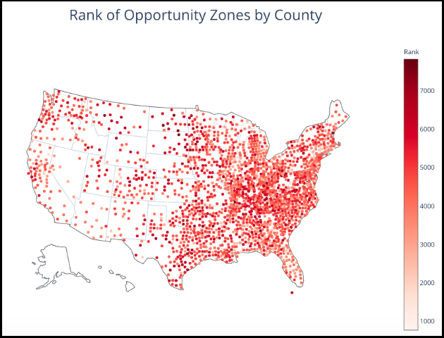
Looking at this visualization we can see……well, nothing. There is too much going on to yield meaningful insights from this map. Looking at this also made me question the lack of regionality taken into account — the ‘best’ census tracts are likely influenced by economic trends in neighboring regions over the 5 year timeframe.
Based on this I created code to automatically group together census tracts in similar areas. K-means clustering is a great method to achieve just this and after reading Carl Anderson’s post on weighted K-means analysis, I adapted it to my use case. My goal was to use each Opportunity Zone’s ‘Total Average Rank’ in order to influence where the center of each cluster would be drawn on the map.
To explain using Carl’s example, if there are 4 points on a map and one has a much higher ‘Total Average Rank’ than the others, the new point created will lean toward the highest ranked point:


Unweighted vs. Weighted
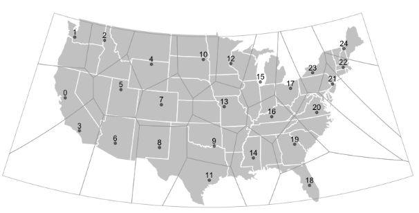
The last thing I needed to do was figure out how many ‘clusters’ I wanted to create. Determining the ‘correct’ number of clusters is still largely an art more than a science, relying on the person’s knowledge of the problem and qualitative insights to determine an ideal amount. I settled on 25 — it provided the best tradeoff of visual digestibility while also evenly segmenting the US into areas large enough to generate macro-level regional insights. Here’s a final output overlayed with a Voronoi visualization to better ‘show’ how the regions were divided up:
This map illustrates 2 things:
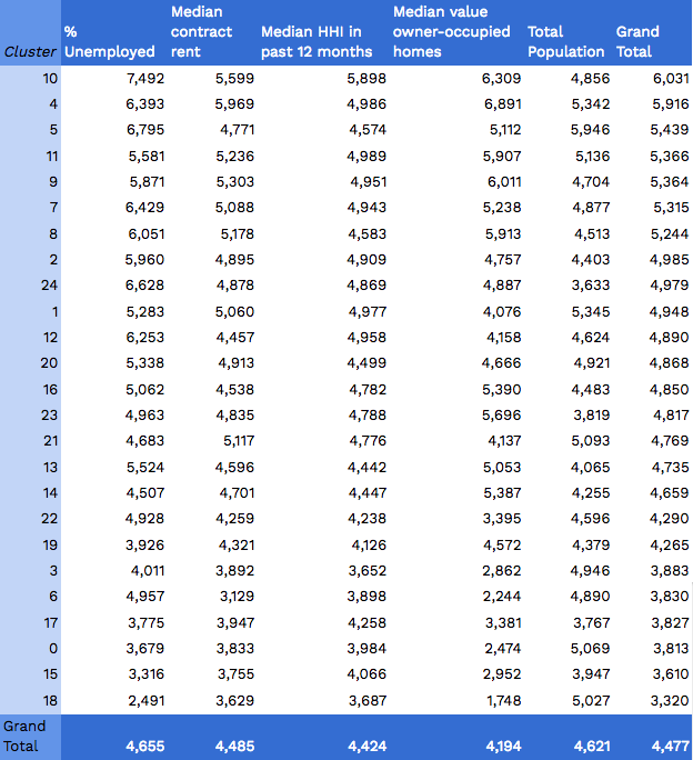
To provide more context, here are the final breakdowns of how each cluster scored overall, higher ranks being ‘best’:
There were many interesting insights from the analysis, summarized as follows:
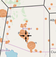
Ozone regions(left) vs cluster w/ major city pops in orange (right)
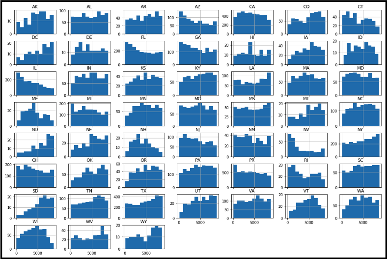
There also appear to be several strategies for how states chose to designate Opportunity Zones. For example, the chart below shows the count of Opportunity Zones in each state (Y-axis) along with the ‘Total Average Rank’ of each (X-axis). Half of the Opportunity Zones were held within 8 states (CA/NY/TX/FL/IL/OH/PA/MI), and these Zones tended to be highly concentrated around major cities within these states. Midwestern states in the US tended to elect much fewer Opportunity Zones, although the area of the Zones tended to span much larger areas vs. their coastal counterparts. The Southeast area tended to elect a high amount of areas across their states in both urban and non-urban areas.
States like NY also had a surprisingly large concentration of high-rated Zones, seen by the skew in the graph below. Overall, ND and WY contained the highest rated zones of any state, with states like IL and NV having the lowest ranked concentration.
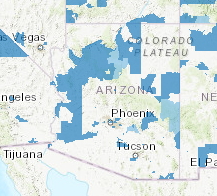
As a final note, this article was intentionally brief on the technical steps taken to generate the final dataset. Steps such as managing missing data in the datasets (imputation), creating ranks, cluster aggregation, etc., were not discussed but were major components in arriving to the final analysis. If there is enough interest I would be happy to dive into the mechanics in a future post. In the meantime, I have included an interactive ARCGIS map below for you to further explore the clusters along with other datasets to provide a jumping point for further analysis!
ARCGIS MAP WITH VORONOI AND LAYERS